Auditory
Source//
Freelance Client
Discipline//
Brand Identity & Design
Role//
Creative Direction & Designer
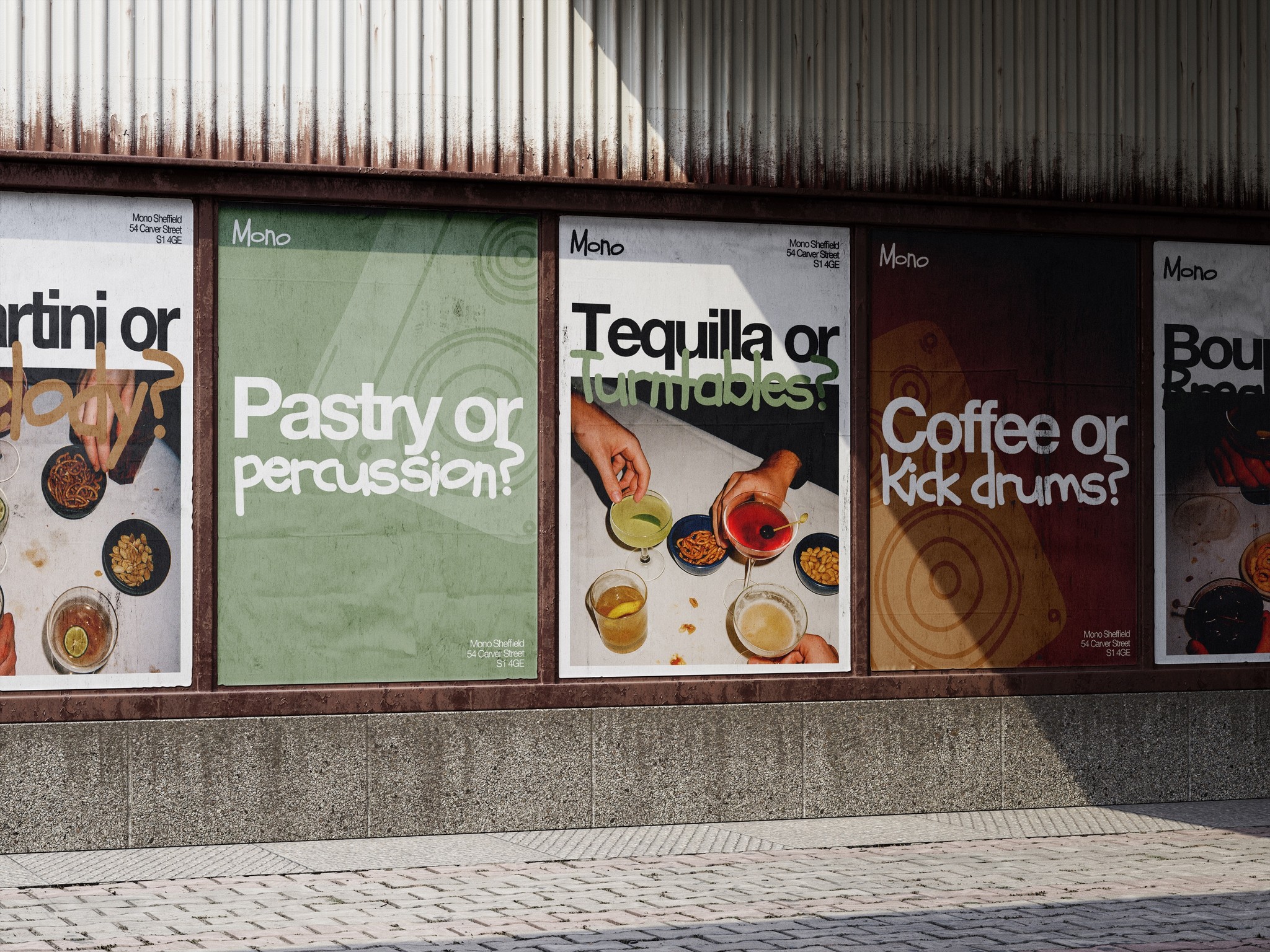
As creative director and graphic designer, I partnered with Auditory, a Sheffield-born underground house music label and party series, to craft a visual identity from the ground up. With only a name and an open brief, I developed a minimalist design language inspired by the physicality of sound, the pulse of the dance floor, and the precision of audio frequencies.
The identity draws from modernist principles, but pulses with the energy of the scene: clean typography, a stripped-back palette, and graphic motifs that echo waveforms, interference, and rhythmic repetition. At its core is a modular system — built to flex across digital and physical contexts, from launch reels to event posters — yet always anchored in a sense of movement and sonic clarity.
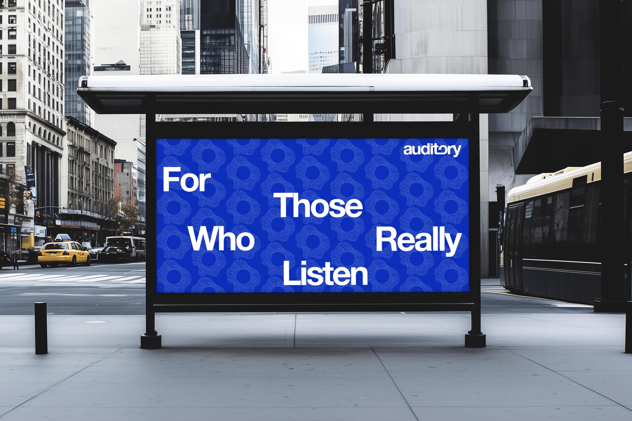
The result is a brand that’s forward-facing but firmly rooted in Sheffield’s legacy of club culture: quietly confident, visually restrained, and designed for those who really listen.
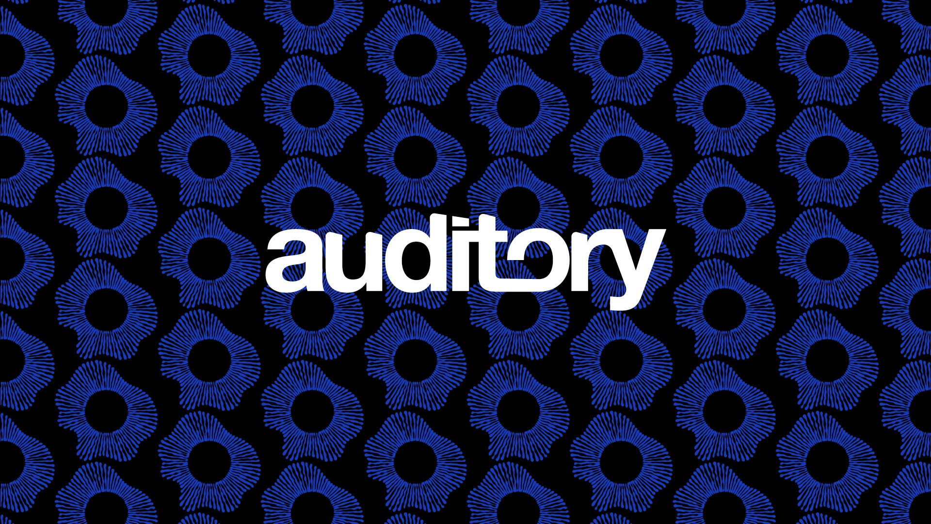
The Auditory logotype uses custom, geometric lettering to reflect a modern and minimal identity grounded in underground electronic music. A split ‘O’ introduces a subtle visual hook, inspired by turntable arms and audio hardware. The type is clean but bold, suggesting clarity in sound and intention. Designed for high visibility across print and digital, the logo balances sharp professionalism with the brand’s experimental, club-oriented roots.
The standalone mark represents a stylised sound wave, abstracted into a circular form that evokes vinyl records, speaker cones, and movement. It’s designed to scale well as a brand shorthand—ideal for merchandise, digital avatars, and promo visuals. The consistent radial rhythm visually communicates energy and pulse, key to Auditory’s sound identity. It works independently or alongside the full logo to reinforce the brand’s connection to immersive audio and underground club culture.
To support Auditory’s digital presence, I created a flexible suite of social templates built for speed, clarity, and strong brand recognition. Designed for event promos, releases, artist profiles and general updates, the system blends modular layouts with deep blues, waveform textures, and low-lit photography — evoking the atmosphere of late-night spaces. Stripped-back yet expressive, each asset is built for scalability and speed, allowing the client to drop in content via Canva without breaking the brand system. The result is a bold, modern toolkit that lets the music speak, while the brand holds space in the background like a well-tuned system.