Grounded London
Source//
Freelance Client
Discipline//
Art Direction & Design
Role//
Creative Direction & Design
I collaborate with Grounded London, an underground house music label, to define and elevate their visual identity across both physical and digital touchpoints.
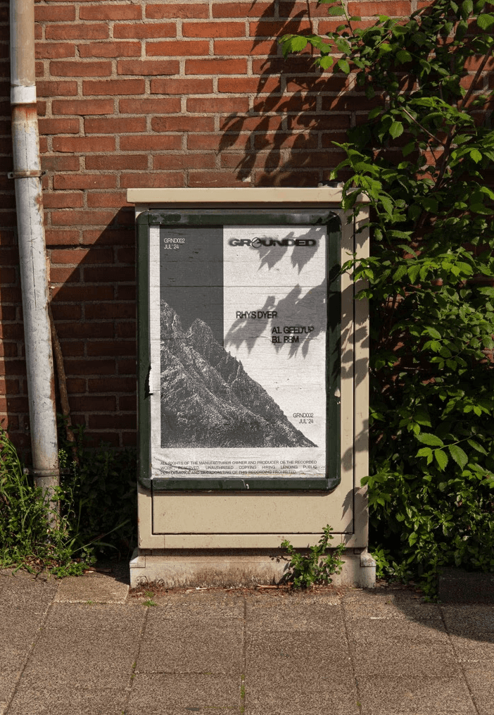
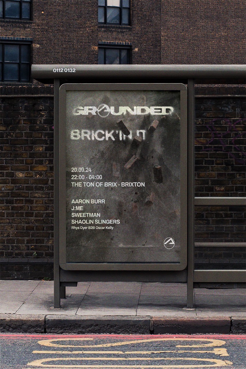
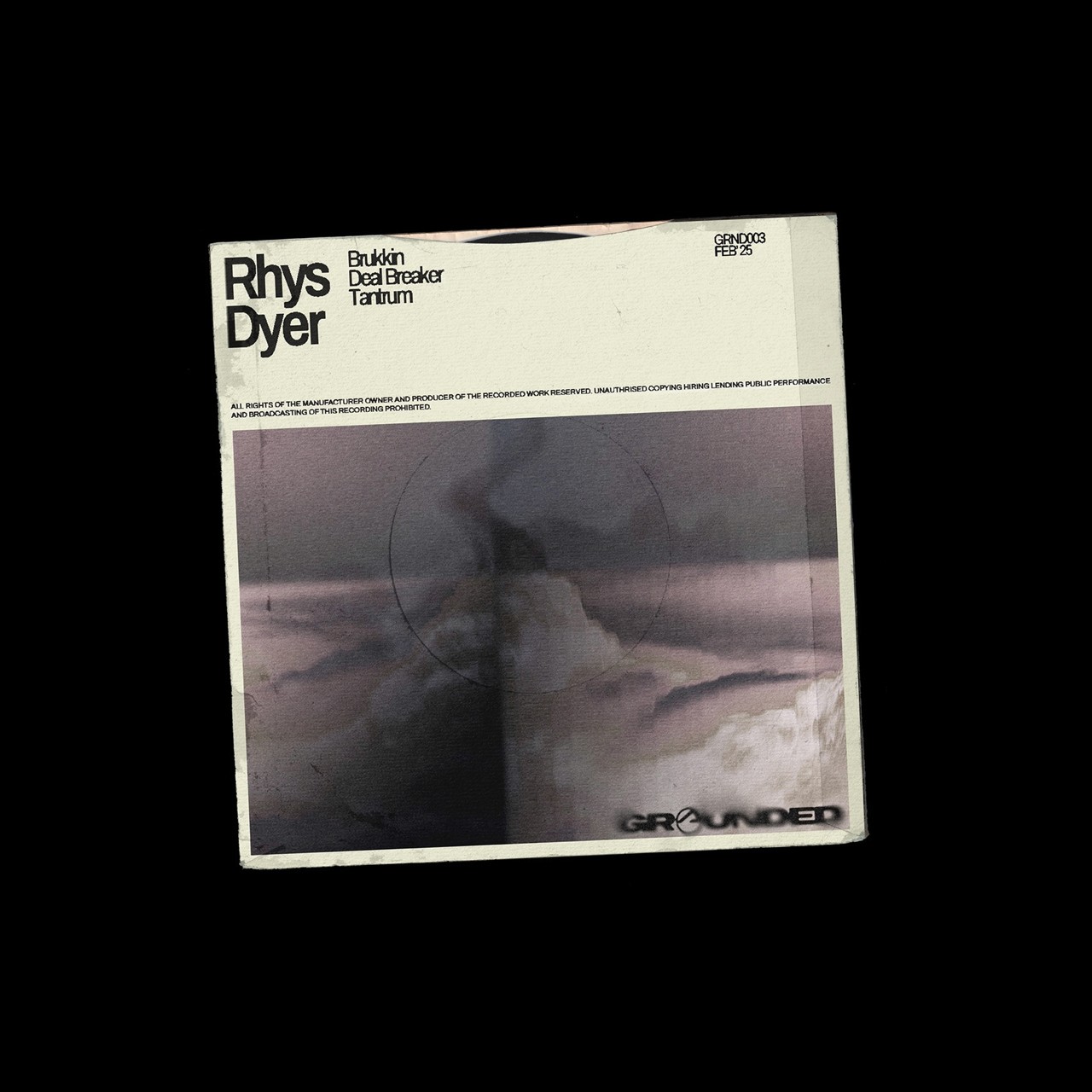
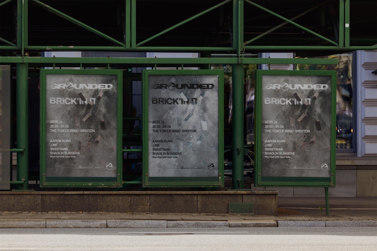
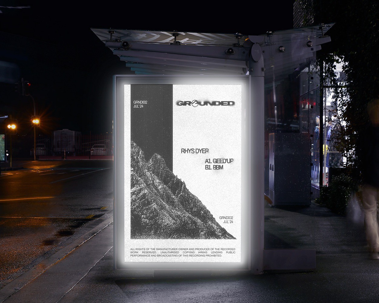
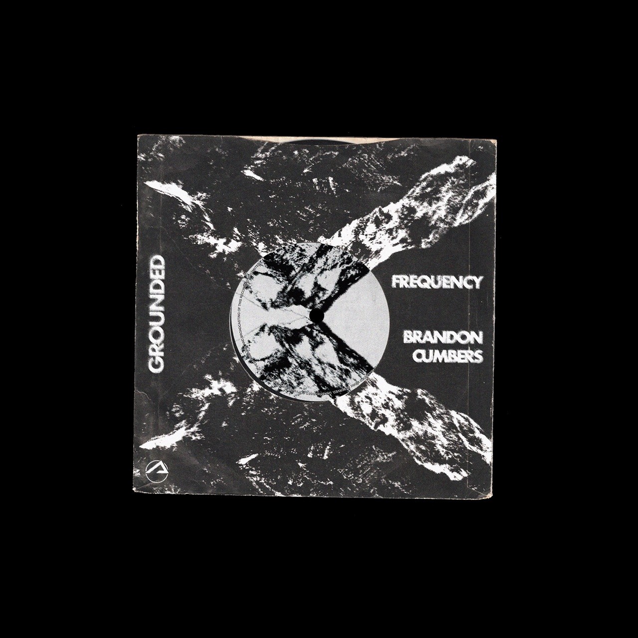
At the heart of this project was the refinement of their core mark. I reworked their existing logo into a cleaner, more versatile symbol. One that resonates with the label’s raw, rhythmic sonic signature. This updated mark became the cornerstone of a broader visual system that spans music packaging, promotional materials, and branded content.
Building from this foundation, I developed a design language that reflects the stripped-back, tactile sensibilities of house music. Vinyl sleeves and digital release covers feature abstract shapes, bold, utilitarian typography, and minimalist grids — channeling the energy of classic dance music culture through a contemporary lens. The artwork is deliberately stark yet expressive, referencing analog textures and lo-fi aesthetics while maintaining clarity and impact.
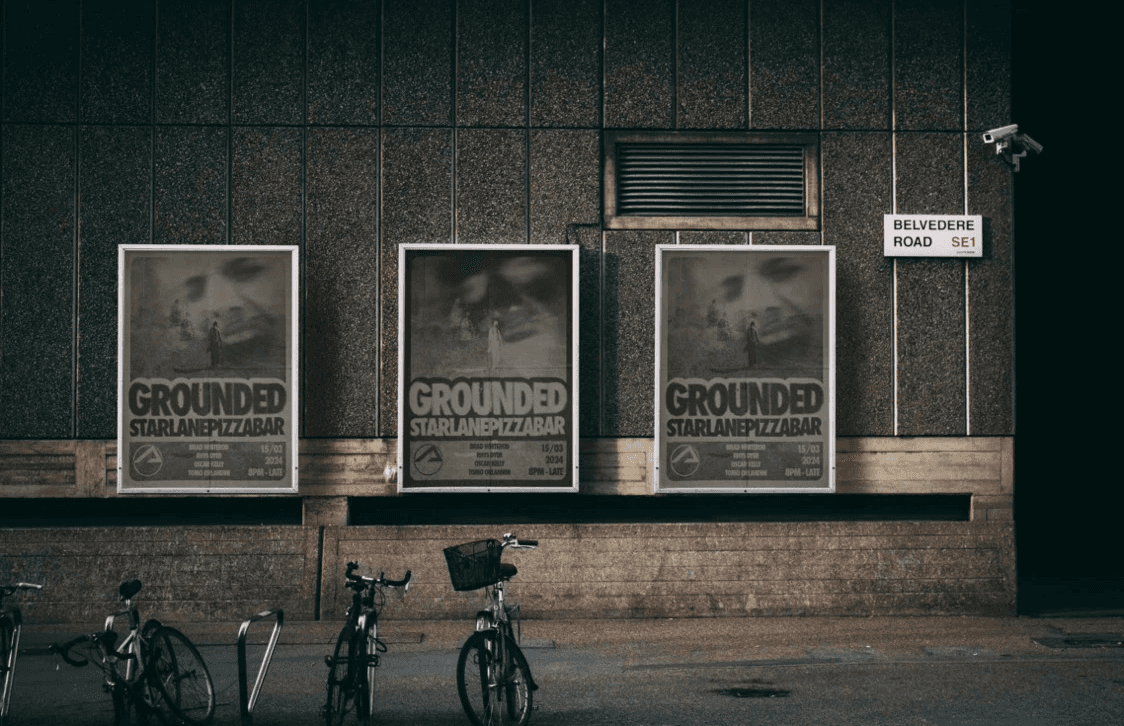
Beyond release art, I crafted posters, social media assets, and merchandise with a focus on cohesion and adaptability. The visual identity draws on high-contrast palettes and modular compositions that echo the immediacy of rave flyers and DIY zines, but with refined typographic control and spatial awareness. It’s a system designed to be equally effective on a record shelf, in a feed scroll, or under club lights.
This work balances underground grit with design discipline, creating a visual rhythm that complements the music’s physicality, intensity, and soul. It’s a living system, built to evolve, move, and resonate.